TIPPS & TRICKS
Bei „Tipps & Tricks" soll es darum gehen, Informationen über meinem Malstil zu vermitteln. Für alle, die mehr wissen wollen.
Mein Stil weicht etwas vom klassischen Aquarellstil ab. Ich male meistens am Anfang nass in nass. Danach setze ich Farben lasierend übereinander, insbesondere bei Fell.
'Tips & Tricks‘ is about conveying information about my painting style. For everyone who wants to know more.
My style differs a bit from the classic watercolor style. I usually paint wet on wet at the beginning. Then I put transparent colors on top of each other, especially with fur.
FELL | fur


1 - VORZEICHNEN | drawing
Zunächst male ich mit Bleistift und Fineliner vor. Der Fineliner, den ich nutze, ist wasserfest - das heißt, er verläuft nicht, wenn das Papier später mit Wasser oder flüssigen Farben in Kontakt kommt. Dafür sollte auf dem Stift "wasserfest/waterproof" vermerkt sein.
First I sketching with pencil and fineliner. The fineliner is waterproof - that means it won't smudge if the paper later comes into contact with water or liquid paints. In this case, "waterproof" should be noted on the pen.
2 - SCHATTIERUNG | shading
Als nächstes überlege ich mir, welche Farbe die Grundfarbe des Tieres ausmacht. Bei diesem Wolf habe ich mich für ein Blau-Grau entschieden. Also grundiere ich in dieser Farbe - achte jedoch auf weiße und dunklere Partien.
Der Pelz eines Wolfes besteht aber nicht nur aus grauen, sondern auch aus braunen Tönen. Es kann natürlich reizvoll sein, beim Malen genau in diesen Farbschattierungen zu bleiben – ich schöpfe allerdings gern aus dem Vollen der Farbpalette. So lasse ich graue Fellpartien mit Blau und Violett kühler wirken. Mit Braun lasse ich graues Fell hingegen wärmer erscheinen. Ich fange mit hellen Nuancen an und werde für Kontraste dunkler.
Next, I think about what color makes up the basic color of the animal. For this wolf I decided on a blue-grey. So I prime in this color - but pay attention to white and darker areas.
The fur of a wolf consists not only of gray, it has also brown tones. Of course, it can be attractive to stay exactly in these shades of color when painting - but I like to draw from the full color palette. This is how I make gray areas of fur look cooler with blue and violet. With brown, on the other hand, I make gray fur appear warmer. I start with light shades and go darker for contrasts.
3 - AKZENTE | accents
Für braunen Pelz nutze ich zusätzlich Beige, Gelb, Orange, Rot und manchmal auch Violett – das macht es insgesamt etwas lebendiger, da sich unser Licht und damit die Art wie wir Dinge wahrnehmen auch aus einem großen Farbspektrum zusammensetzt. Gelb und Rot setze ich auch hier besonders als Akzente ein. Gelb für hellere, sonnige Partien – Rot für dunklere, intensivere Teile.
Wenn alles soweit fertig ist, setze ich noch vereinzelt weiße Kontraste mit einem weißen Aquarell-Buntstift oder weißer Aquarellfarbe. Für schwarze Kontraste verwende ich schwarze Aquarellfarbe oder einen dickeren, schwarzen Fineliner.
Ganz zum Schluss werfe ich großzügig Farbspritzer auf das fertige Bild, das gibt dem Ganzen etwas Zufälliges und auch Lebendiges.
For the brown fur, I also use beige, yellow, orange, red and sometimes violet - that makes it a little more lively overall, the way we perceive light and other things is also made up of a large color spectrum. I also use yellow and red as accents. Yellow for lighter, sunny parts - red for darker, more intense parts.
When everything is ready, I add some white contrasts with a white watercolor pencil or white watercolor paint. For black contrasts I use black watercolor or a thicker, black fineliner.
At the very end, I generously throw splashes of paint onto the finished painting, which gives the whole thing something random and also lively.
AUGEN | eyes

LICHTPUNKT | point of light
Die Augen eines Schneeleoparden können aus mehreren Farben bestehen: Aus warmem Gelb und Beige bis hin zu Grün, Braun und bläulichem Grau. Ich mag dieses Farbenspiel und verwende es gern in meinen Zeichnungen.
Zunächst kennzeichne ich mir einen Teil bei der Pupille, den ich als Lichtpunkt weiß lassen werde. Danach fange ich meistens relativ großflächig mit Gelb an und setze Schicht für Schicht Beige, Grün, Siena (rotbrauner Ocker) darüber. Grün verwende ich nur für einige Partien und Siena nur für kleine Kontraste. Für den Schatten unter dem oberen Augenlid nehme ich eine Mischung aus Indigo und Grau, manchmal auch Braun.
Für das untere Augenlid verwende ich hier hauptsächlich Indigo und konstrastiere die äußeren Linien mit Schwarz. Den inneren Teil lasse ich überwiegend heller stehen und setze Blau hinzu. Die schattigen Teile rechts und links werden dunkler.
Am Ende male ich in den Lichtpunkt hinein erst ein helleres Blau und oben zum Lid hin ein dunkleres Blau. Das lässt die Augen lebendiger erscheinen.

A snow leopard's eyes contain several colors: from warm yellow and beige to green, brown and bluish gray. I like this play of colors and like to use it in my paintings.
First I mark a part of the pupil that I will leave white as a point of light. Then I usually start with a relatively large area of yellow and set layer by layer beige, green and sienna (red-brown ocre). I only use green for a few parts and sienna only as small contrasts. For the shade under the upper eyelid, I use a mix of indigo and gray, sometimes brown.
For the eyelid, I mainly use indigo and contrast the outer lines with black. I leave the inner part lighter and add blue. The shaded parts on the right and left become darker.
At the end I paint pale blue into the point of light and a darker blue towards the lid. This makes the eyes look more alive.

MATERIAL
Als Papier nutze ich "Römerturm" Aquarellpapier 240 g, ab dem Format 30 x 40 cm den Universalblock von "Vang" 300 g. Ich verwende Aquarellfarben von "Winsor & Newton", hauptsächlich diese Farbtöne:
As paper I use 'Römerturm‘ watercolor paper 240 g, from the format 30 x 40 cm the universal block from 'Vang‘ 300 g.
I'm using water colors of 'Winsor & Newton‘, mainly these shades:

Blau/Blue
Grau/Grey
Beige
Braun/Brown
Violett/Violet
Rot/Red
Orange
Gelb/Yellow
Grün/Green
Schwarz/Black
Weiß/White
- Intense Blue, Cobalt Blue, Cerulean Blue, Ultramarine, Turquoise
- Indigo, Paynes Grey
- Raw Sienna, Yellow Ocre
- Burnt Sienna, Light Red, Burnt Omber, Sepia, Vandyke Brown
- Mauve, Diox Violet
- Cadmium Red, Cadmium Red Hue, Cadmium Red Deep, Alizarin Crimson Hue (dunkel/dark), Rose Madder
- Cadmium Orange
- Lemon Yellow, Gambog Hue
- Hook Green Light, Hook Green Dark, Emerald, Viridian, Sap Green
- Lamp Black
- Chinese White
MALVORLAGEN | coloring pages
Für alle, die gern ausmalen, habe ich nun auch Malvorlagen von Hand gestaltet. Denn Malen macht nicht nur Spaß, es fördert ebenso die Kreativität und kann dabei helfen, innerlich zur Ruhe zu kommen - ein Effekt, den ich selbst sehr schätze. Hier zeige ich, wie ich die Bilder ausgemalt habe. Dabei habe ich mich an der Realität orientiert und möchte so unsere großartige Welt der Tiere präsentieren - und ein wenig Hilfe bei der Farbwahl geben. Falls Du allerdings jemand bist, der gern alles ganz anders machen will, kannst Du Deine Bilder natürlich so ausmalen wie du es möchtest. Lasse Deiner Kreativität freien Lauf!
For everyone who likes to coloring, I have now also designed coloring pages by hand. Because painting is not only fun, it also promotes creativity and can help to find inner peace - an effect that I really appreciate. Here I show how I colored the pictures.
I based myself on reality and would like to present our great world of animals - and give a little help with the color choice. However, if you are someone who likes to do everything completely differently, you can of course color your pictures however you want. Let your creativity run free!
Tipps & Tricks

1 - STIFTE | pencils
Ich verwende zum Ausmalen ein Set aus 36 Buntstiften in verschiedenen Farben. Die Stifte sollten qualitativ hochwertig sein und auf dem Papier gut Farbe abgeben.
(Meine Marke: "Faber Castell")
I use a set of 36 pencils in different colors for coloring. The pens should be in a good quality and should give a good color on the paper.
(My brand: 'Faber Castell‘)

2 - FARBEN MISCHEN | mixing colors
Um Fell, Federn und Augen realistischer darzustellen, wähle ich miteinander verwandte Farbtöne und mische sie auf dem Papier - hellere Töne nehme ich für beleuchtete Flächen, dunklere für schattige Partien. Ich persönlich mag es, wenn das fertige Bild gemalt aussieht und nicht wie ein Foto wirkt. Ich lasse gern ganz offensichtlich Buntstift-Striche stehen und gebe ihnen Schwung, um Dynamik zu erzeugen.
To make fur, feathers and eyes more realistic, I choose related tones and mix them on the paper - lighter tones for highlighted areas, darker for shadowed areas. I personally like it when the finished picture looks painted and not like a photograph. I like to leave the obvious crayon lines and give them oomph to create dynamism.

3 - WEISSE FLÄCHEN | white areas
Bei weißen Flächen gebe ich leichte Akzente in Grau, Blau, Violett, Beige und Braun hinzu. Mit diesen Farben modelliere ich Formen, Licht und Schatten. Blau und Violett macht das Weiß kühler - Beige und Braun wärmer.
On white surfaces I add light accents in grey, blue, violet, beige and brown. With these colors I model forms, light and shadow. Blue and violet make the white cooler - beige and brown warmer.

4 - AUGEN | eyes
Bei den Augen lasse ich fast immer mindestens einen Lichtpunkt in Weiß unausgemalt, das lässt sie lebendiger wirken und bringt sie zum Strahlen.
Den oberen Bereich des Auges kann man etwas dunkler gestalten, da dort oft das obere Augenlid einen Schatten wirft.
For the eyes, I almost always leave at least one point of light unpainted in white, which makes them appear more alive and makes them shine.
The upper area of the eye can be made a little darker, since the upper eyelid often casts a shadow there.

5 - SCHWARZE LINIEN | black lines
Falls die schwarzen Linien durch das Übermalen schwächer werden, zeichne ich sie mit einem schwarzen Buntstift nach - dabei am besten fest aufdrücken. Ein dicker schwarzer Fineliner, der auf der Oberfläche haftet, geht natürlich auch. Die ursprünglichen Linien können ruhig locker übermalt werden - für eine zusätzliche Vielschichtigkeit.
If the black lines become weaker as a result of painting over them, I trace them with a black colored pencil - it is best to press down firmly. A thick black fineliner that sticks to the surface works aswell. The original lines can easily be painted over - for an additional complexity.
BEISPIELE | examples
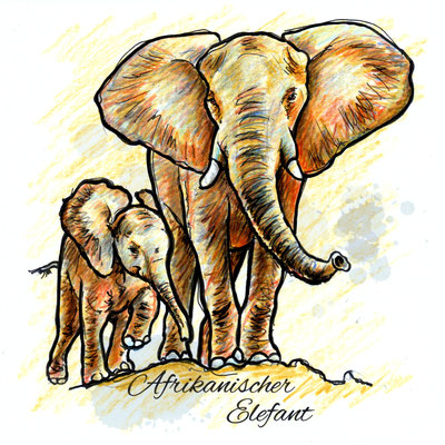
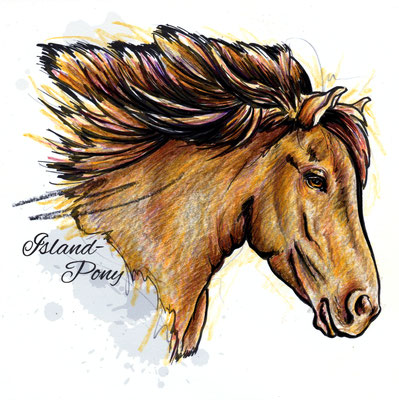
SÄUGETIERE | mammals


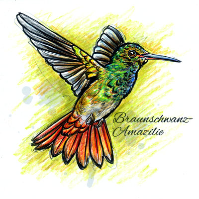
VÖGEL | birds


SONSTIGE | other